Maxello Branding
A Clean, Bold Identity Rooted in Trust and Flavor
In a dynamic FMCG landscape bursting with noise and visual clutter, Maxello rises with a clarity that’s impossible to ignore. Its bold, fresh brand presence isn’t an accident; it’s a deliberate and strategic choice that reflects not only the quality of its offerings but also the mindset of today’s snack-conscious consumer.
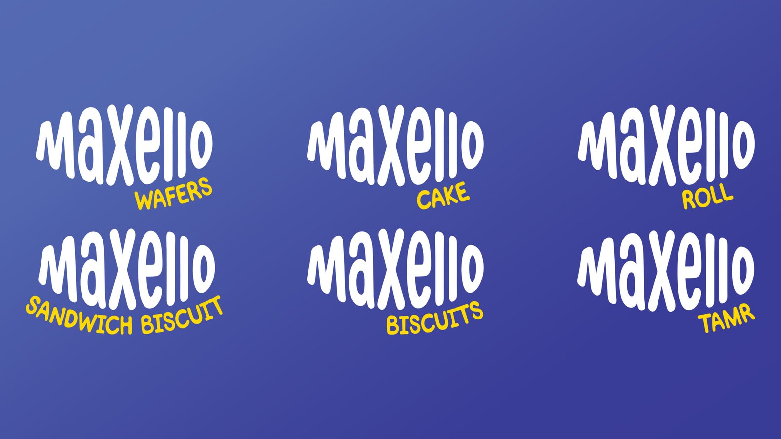
At the heart of Maxello’s visibility is its distinctive logo, bathed in a crisp combination of blue and white. This isn’t just a color palette; it’s a brand language that speaks of authenticity, precision, and emotional reassurance. It echoes Maxello’s unwavering commitment to delivering high-quality products across biscuits, wafers, cakes, and rolls. Every detail of the visual identity has been carefully considered to ensure the Maxello name doesn’t just catch the eye. It invites trust and sparks appetite.
What We Did:
- Brand Identity Development
- Packaging Design
- Flavor-Based Branding
- Social Media Branding
- Retail Shelf Visibility


Building a Brand That Sells at First Sight
- Brand Identity Development
We crafted the Maxello identity from the ground up. Starting with a name that feels bold and memorable, and designing a logo system that communicates clarity, trust, and appetite appeal. Every design choice, from font to color palette, was strategically selected to resonate with FMCG consumers and ensure instant brand recall across all touchpoints. - Packaging Design
In a high-velocity retail environment, packaging is your first impression; Maxello’s needed to stop traffic. We developed a packaging system that was not only visually consistent across biscuits, cakes, rolls, and wafers, but also easy to recognize, flavor-forward, and shelf-dominant. Iconic layouts, clean design language, and visual storytelling helped turn each SKU into a standalone hero within a unified brand family. - Flavor-Based Branding
Each Maxello flavor tells its own story. From Hazelnut Chocolate to Halawa & Honey, we didn’t just label flavors, we brought them to life visually and emotionally. We created a unique color and imagery system for each variant that helps consumers instantly associate flavors with feelings, cravings, and occasions. - Social media Branding
We translated Maxello’s identity into a scroll-stopping digital presence. This included designing cohesive templates, content pillars, and playful brand voice guidelines to ensure Maxello’s social media felt just as consistent and crave-worthy as the products themselves. Every post was built to drive engagement, build trust, and convert curiosity into loyalty. - Retail Shelf Visibility
Standing out in the snack aisle is no easy feat. We conducted a competitive shelf audit and designed Maxello’s visual language to punch through the noise: using bold contrast, flavor cues, and iconic logo placement. Strategic placement of design elements ensures the brand maintains strong presence whether stacked side-by-side or displayed face-out.
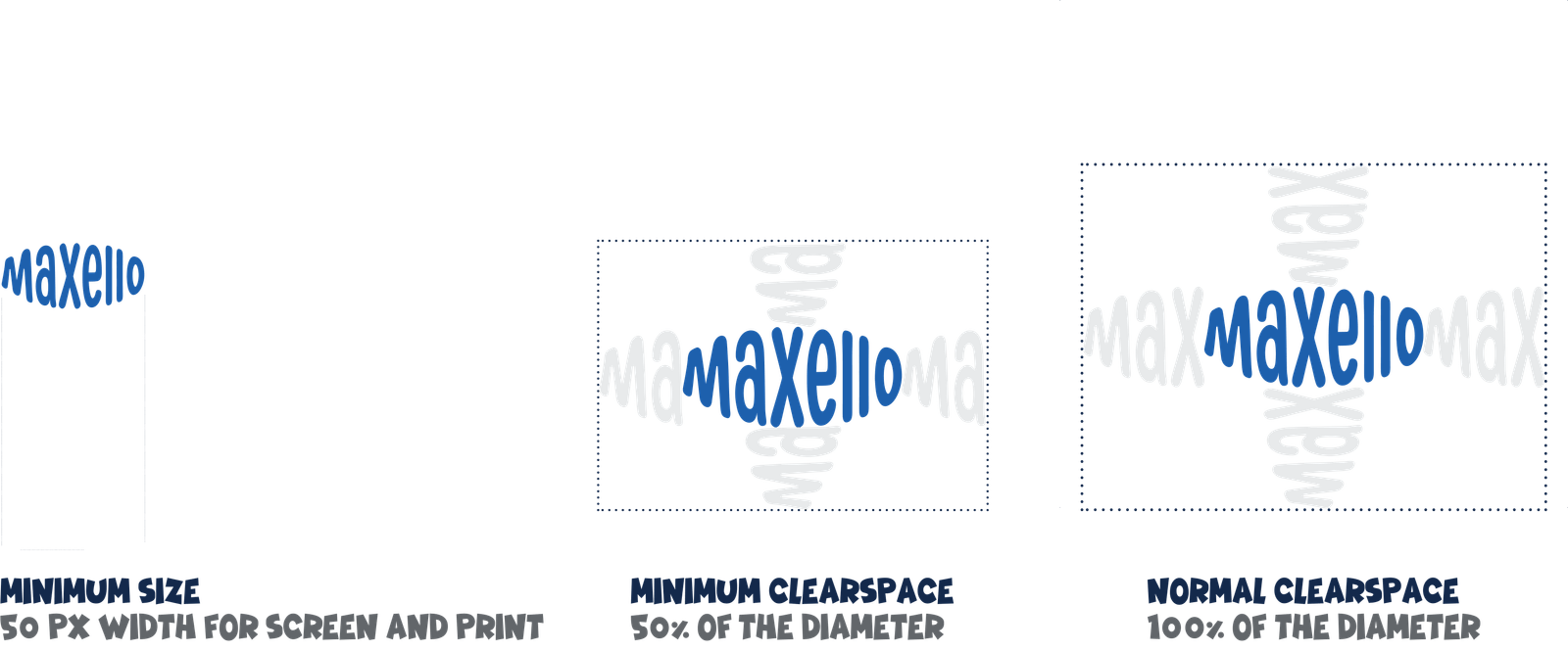
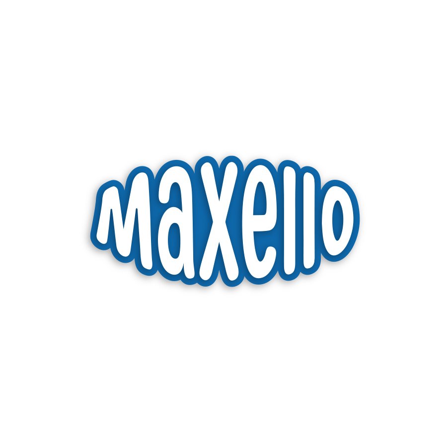
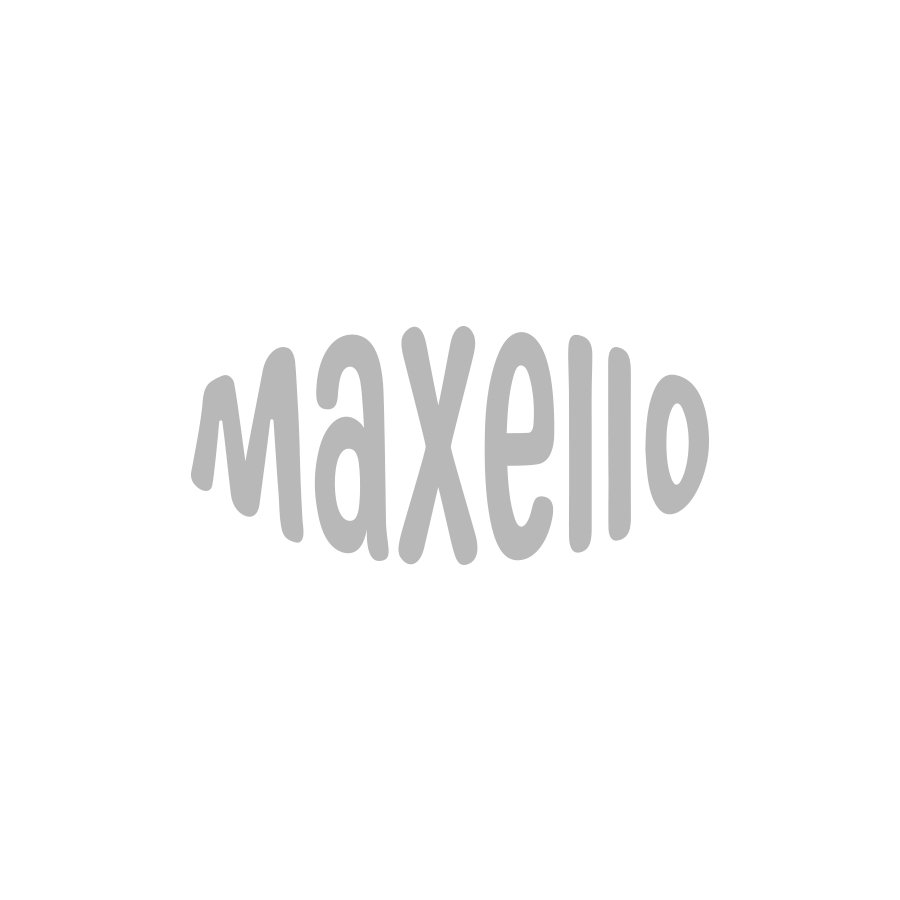
Logo & Typography – Confidence You Can Taste
The Maxello wordmark is built for visibility, memorability, and ease of recognition. Its typography balances soft curves with strong geometry, embodying the duality of the brand. Welcoming yet assertive, fun yet dependable.
The logotype’s rounded edges create a feeling of warmth and approachability, mirroring the indulgent experience of Maxello’s treats. Meanwhile, the sturdy structure of the font: solid, clean, and confident; grounds the brand in reliability and strength. Whether printed on a wafer wrapper, a digital campaign banner, or a billboard, the typography maintains optical clarity and brand consistency across every touchpoint.
The letter spacing and proportions are intentionally crafted to make the name “Maxello” feel balanced, modern, and unmistakably bold. Even from a glance on a crowded retail shelf.
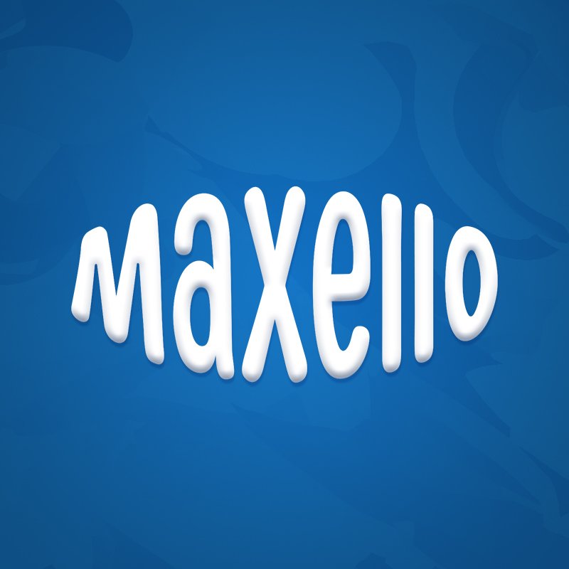
Color Story – The Strength Behind Blue & White
Maxello’s signature palette of bold blue and clean white is not only visually harmonious, it is psychologically compelling.
- Blue: A timeless symbol of trust, calm, and dependability, forms the emotional core of the identity. In the food world, it’s a subtle yet powerful color, evoking loyalty and care while setting Maxello apart from the red-heavy tones often dominating FMCG brands. It suggests a brand that’s confident without being aggressive. One you can count on to deliver time and time again.
- White: Acts as the brand’s visual breath. It creates contrast, clarity, and sophistication. Its use in Maxello’s identity speaks to freshness, hygiene, and transparency. Key values in the minds of consumers navigating a fast-paced snacking environment.
Together, these colors create an aesthetic that’s both emotionally resonant and strategically effective. Blue and white together say: This is a brand that is trustworthy, high-quality, and forward-thinking, without needing gimmicks to prove it.

We don’t just market Maxello; we make sure it’s remembered. By blending data with creativity, we shape narratives that stick in the minds of customers and make Maxello the go-to choice in a crowded shelf.
Shelf Impact & Digital Appeal A Unified Expression
We don’t wait for trends to pass by. We shape them. Through influencer partnerships, real-time content calendars, and meticulously tailored messaging, we create a dynamic Maxello presence that evolves with its audience; seasonally, strategically, and always in tune with what’s next.