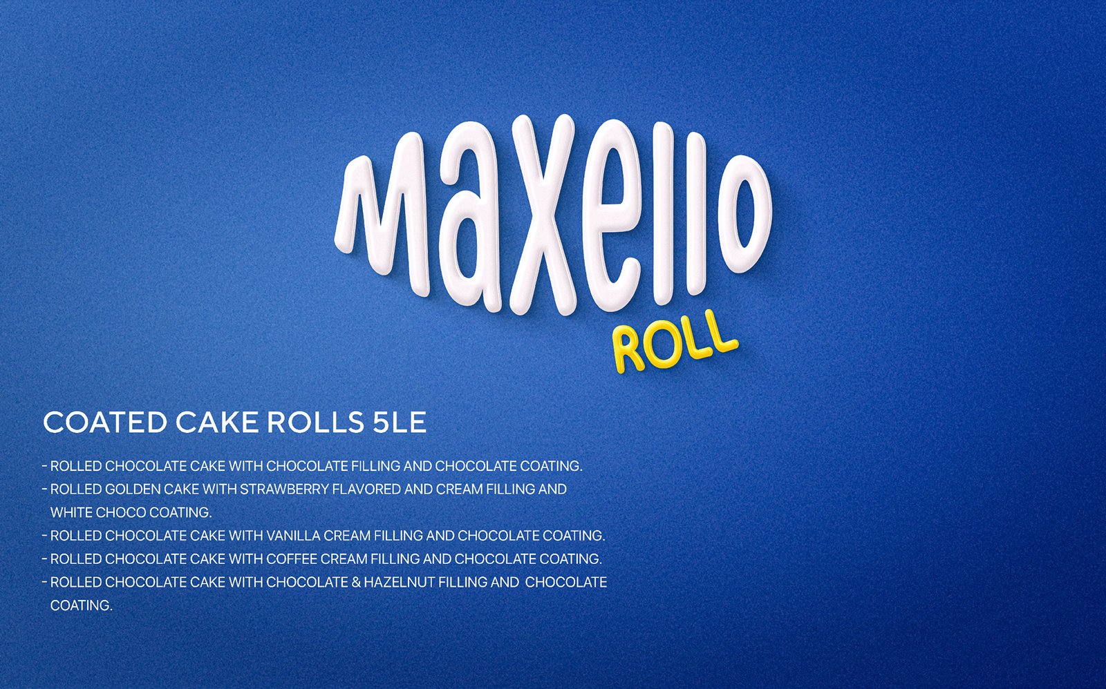
MAXELLO ROLLED CAKE
A Sweet, Bold Identity Rooted in Trust and Every Delicious Fold
The Art of the Roll
In the dynamic and crowded FMCG market, Maxello Rolled Cake stands out thanks to its clean visual identity. Its bold presence is not accidental, but a strategic decision aimed at reflecting the quality of its light and fluffy cakes and rich fillings. We designed this identity to appeal to the consumer seeking a snack that combines traditional taste with a modern and appealing look.
Visual Storytelling
At the heart of Maxello’s excellence lies its iconic logo, framed by a blend of blue and white that evokes a sense of freshness and quality. These are not merely colors; they are a visual language that speaks to precision in manufacturing and attention to detail. Every “fold” in the product’s identity reflects our commitment to delivering superior cakes that surpass the competition in the roll and cake categories.
Appetite & Trust
Every detail of Maxello Rolled Cake’s visual identity was carefully considered to ensure the name not only catches the eye but also evokes an immediate sense of confidence and stimulates the appetite. Our goal was to transform each wrapper into an irresistible invitation to experience the perfect cake texture, making the name synonymous with moments of joy and trusted sweetness.
What We Did:
- Brand Identity Development
- Packaging Design
- Maxello-Roll Branding
- Social Media Branding
- Retail Shelf Visibility
Building a Brand That Sells at First Sight
1. Maxello-Roll Identity Development
We designed the Maxello-Roll identity to be a symbol of quality and unforgettable taste. We started by choosing a strong, memorable name and created a visual system that combines confidence, modernity, and “foodie appeal.” Every design decision—from the fonts to the color palette—was carefully chosen to ensure the brand stands out instantly in the FMCG industry.
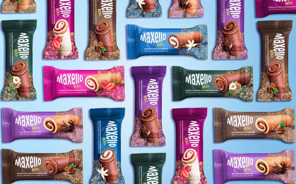
2. Premium Roll Packaging Design
In today’s crowded retail market, packaging is your first language. We’ve developed a Maxello-Roll packaging system that goes beyond mere aesthetics, focusing on shelf dominance. Iconic designs and a clear visual language transform each roll into a hero SKU within the larger Maxello family.
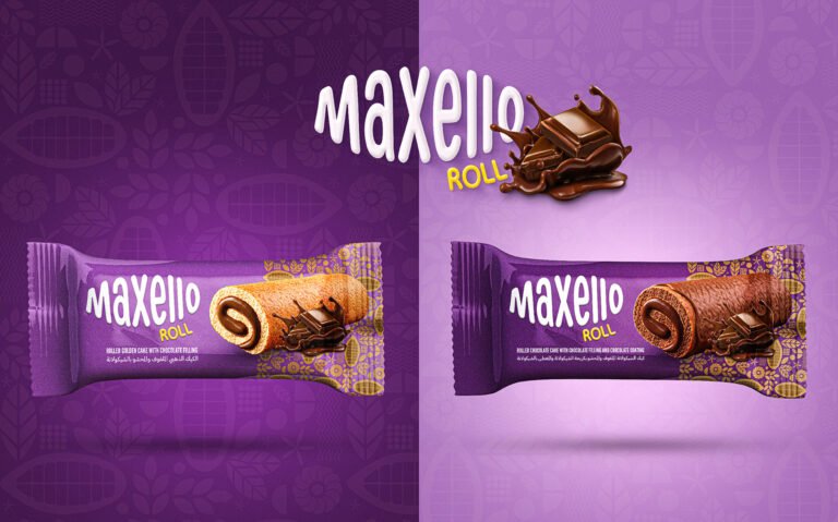
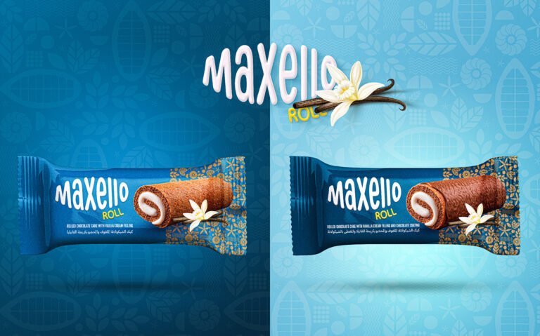
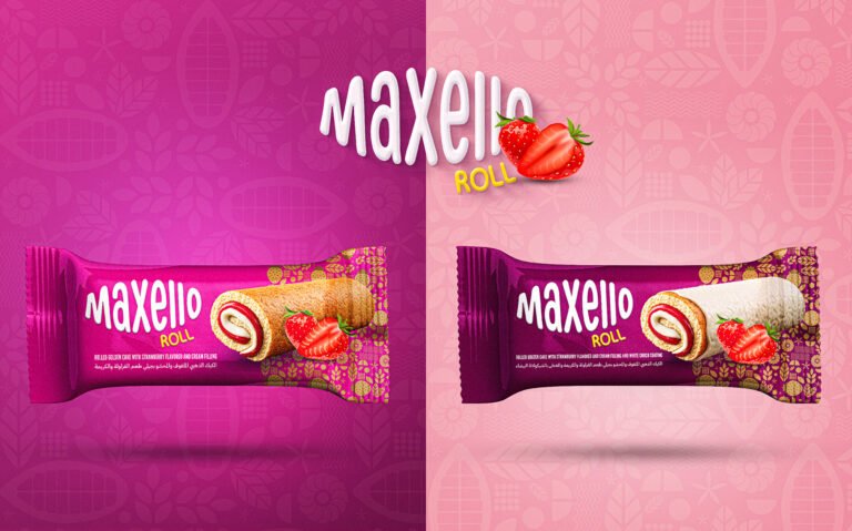
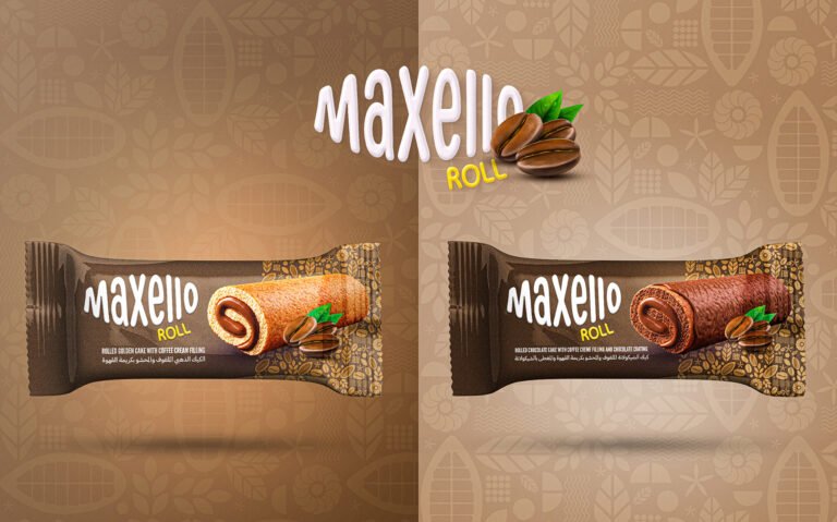
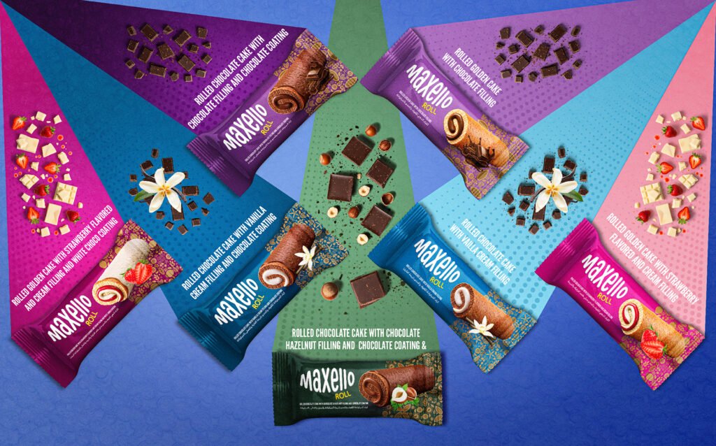
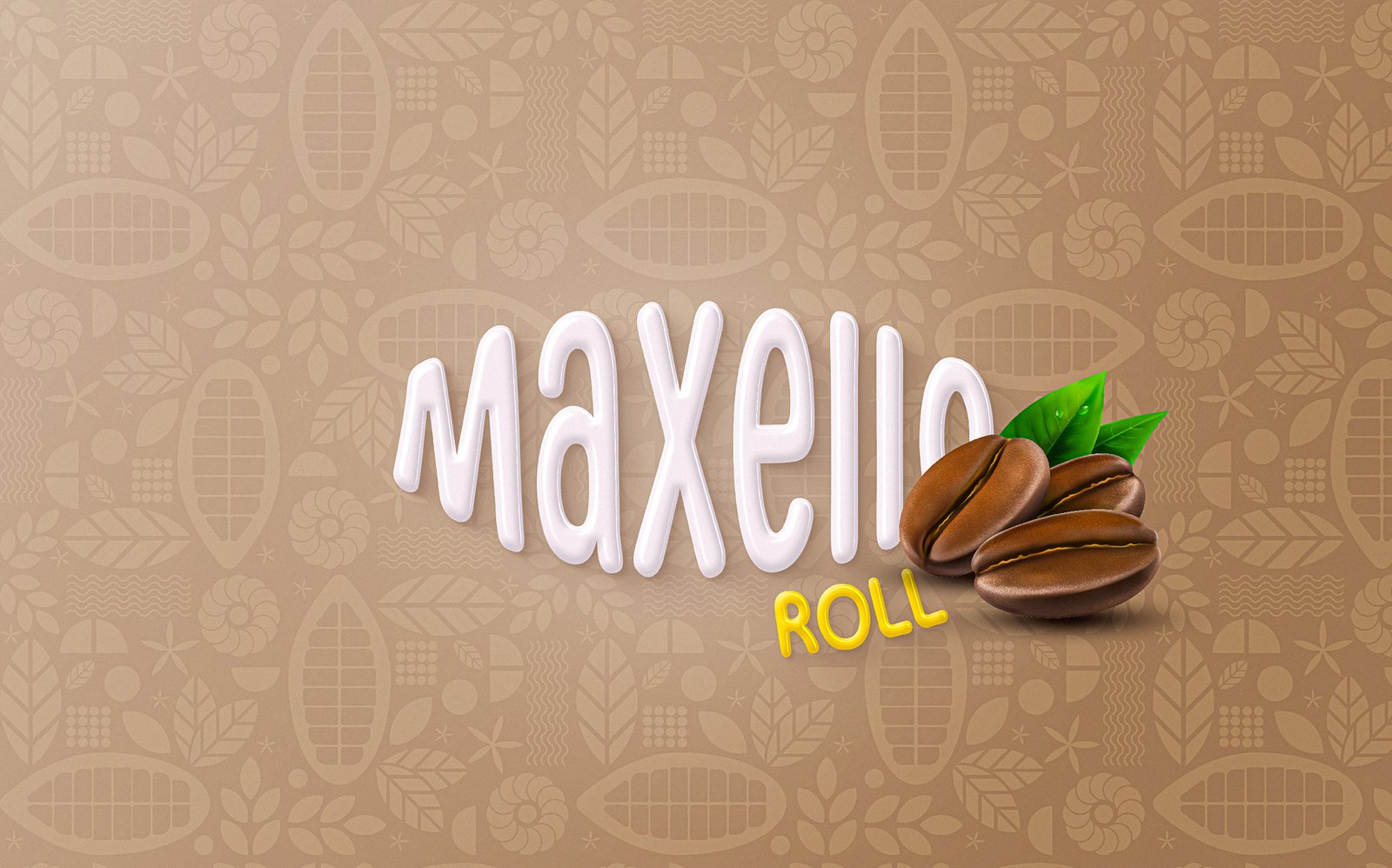
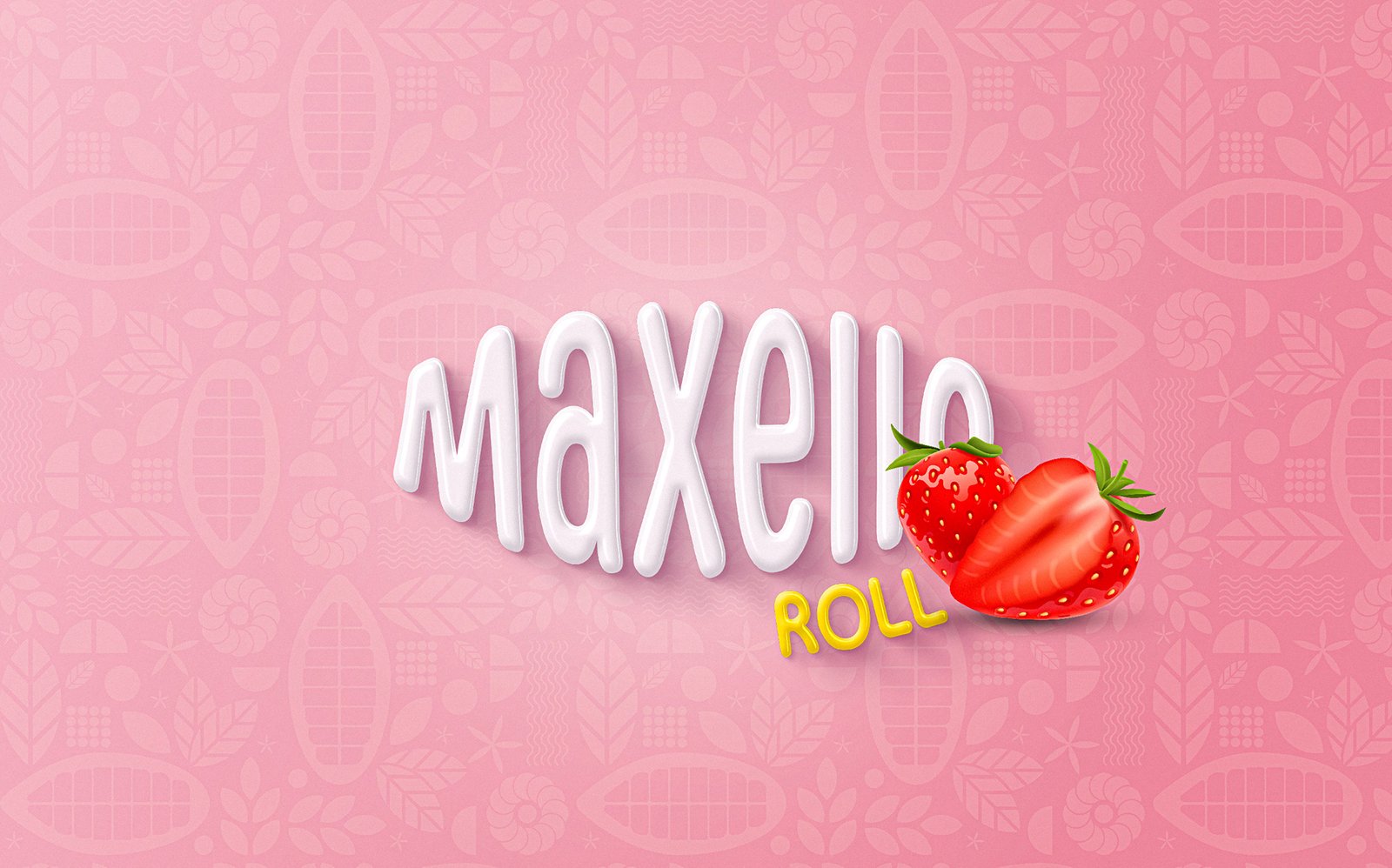
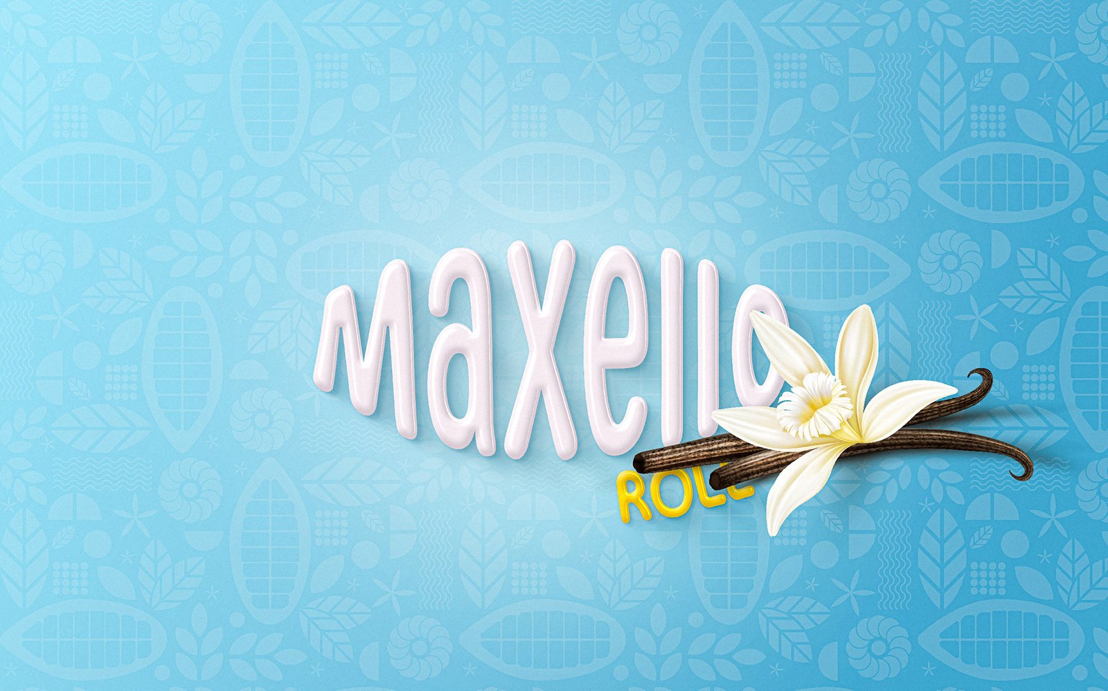
3. Flavor-Focused Roll Experience
Each Maxello-Roll flavor tells a different story. Whether it’s rich chocolate or honeyed sweetness, we didn’t just write the flavor name; we visually and emotionally captured it. We created a unique color and image system for each flavor, helping consumers instantly associate it with the moment and occasion they crave it.
4. Digital Presence & Social Rolls
We brought the Maxello-Roll identity to the digital world with eye-catching, scroll-stopping content. We designed consistent templates, strong content pillars, and a fun, engaging brand voice. Every post was built to increase engagement, build trust, and convert digital curiosity into real-world product loyalty.
5. On-Shelf Dominance
Standing out in the snack aisle isn’t easy. We conducted a thorough analysis of the shelves and the competition, and designed Maxello-Roll’s visual language to cut through the noise. Using strong contrast and strategic element placement, we ensure that the product remains the most visible and appealing, whether displayed horizontally or vertically.
Logo & Typography – Confidence You Can Taste
The Maxello-Roll font was designed for maximum visibility and recognizability. It balances the soft curves of a cake with the strong geometry of a brand.
The rounded edges of the logo create a warm and welcoming feel, reflecting the indulgent experience Maxello-Roll offers. At the same time, the font’s robust structure lends the brand an air of reliability and strength. Whether printed on a small envelope or a large billboard, the font maintains its clarity and identity consistency across every customer touchpoint.
The spacing and letter proportions have been carefully considered to ensure that “Maxello” stands out—balanced, modern, and unmistakably bold—even from a quick glance on a crowded retail shelf.
Color Story – The Strength Behind Blue & White
Maxello-Roll’s color palette of deep blue and pure white is not just an aesthetic choice, but a psychological strategy:
- Blue represents trust, stability, and excellence. In the food industry, it conveys a sense of high quality and makes a brand stand out from the competitors’ traditional colors.
- White: Reflects purity, freshness, and clarity. The design allows for breathability and highlights product details and flavor profiles more sharply and professionally.
Together, these colors create an aesthetic that’s both emotionally resonant and strategically effective. Blue and white together say: This is a brand that is trustworthy, high-quality, and forward-thinking, without needing gimmicks to prove it.
We don't just market the product, we make it memorable. By combining data with digital creativity, we craft stories that make Maxello-Roll the consumer's first choice in busy retail aisles.
Shelf Impact & Digital Appeal: A Unified Expression
We don't wait for trends to pass, we create them. Through well-thought-out content schedules and precise marketing messages, we have created a dynamic presence for Maxello-Roll that evolves with its audience and always stays ahead of the competition.