MAXELLO WAFERS
A Crisp, Bold Identity Rooted in Trust and Crunch
In the dynamic, noisy, and visually cluttered FMCG market, Maxello Wafers stands out unmistakably. The brand’s strong and ever-evolving presence is no accident; it’s a strategic and deliberate choice that reflects not only the quality of our offerings but also the mindset of the modern consumer seeking the perfect snack.
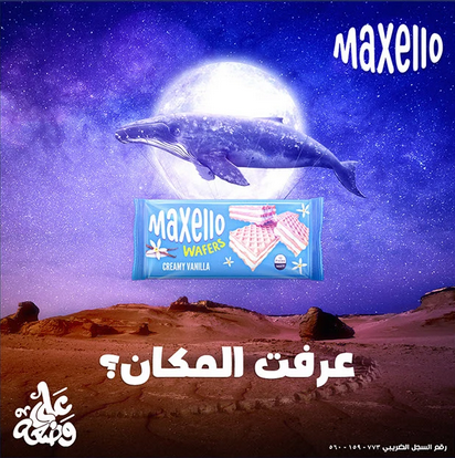
At the heart of Maxello Wafers’ vision lies our distinctive logo, bathed in a vibrant blend of blue and white. This isn’t just a color palette; it’s a visual language that speaks of authenticity, precision, and emotional reassurance. It reflects Maxello’s unwavering commitment to providing high-quality wafers, characterized by their lightness and unique crunch across all flavors.
Every detail of our visual identity has been carefully considered to ensure that the Maxello name not only catches the eye but also builds a bridge of trust with the consumer, whetting their appetite for an unforgettable crunch in every layer.
What We Did:
- Brand Identity Development
- Packaging Design
- Maxello-Wafers Branding
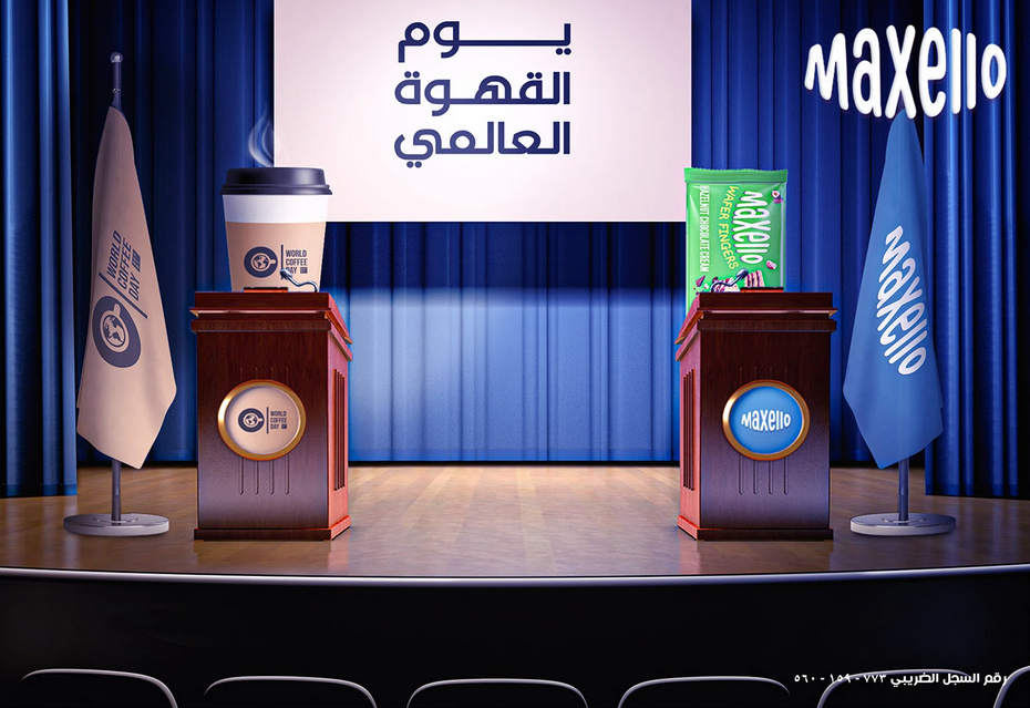
- Social Media Branding
- Retail Shelf Visibility


Building a Brand That Sells at First Sight
- Maxello-Wafers Identity Development
We built the Maxello Wafers identity from the ground up, starting with a memorable and powerful name, and a logo design that combines clarity, confidence, and enticing appeal. Every design choice was carefully selected to ensure the brand is instantly recognizable to FMCG consumers. - Packaging Design
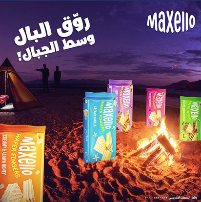
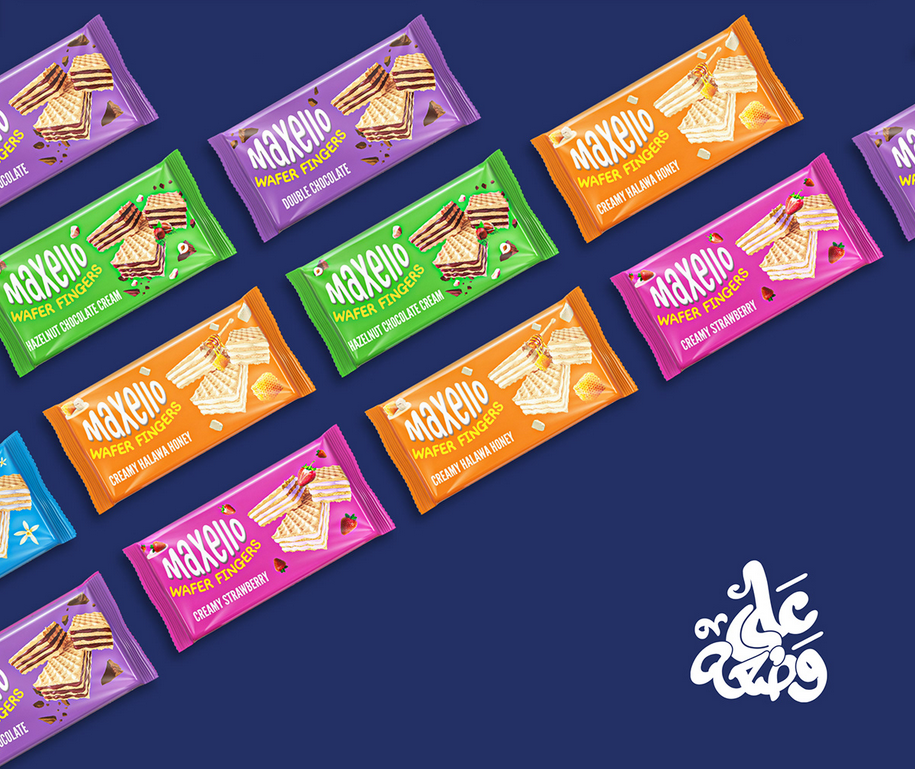
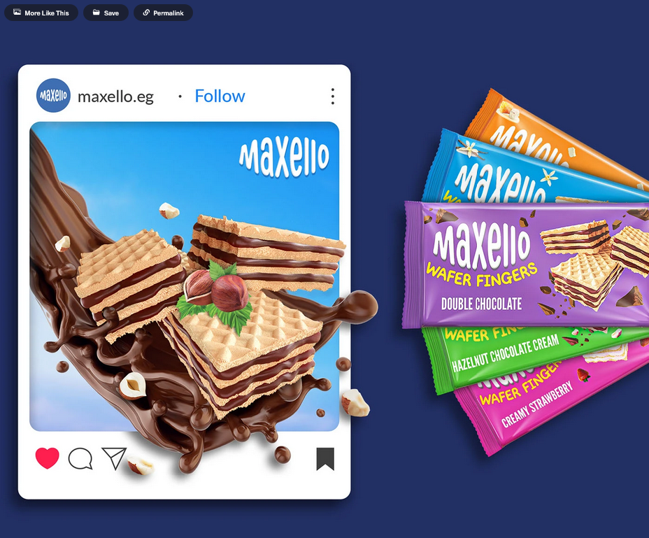
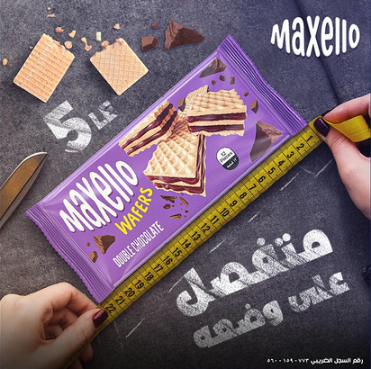
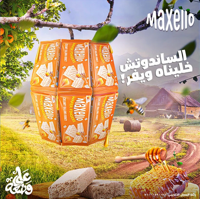
In today’s fast-paced retail market, packaging is your first impression. We designed a packaging system for Maxello Wafers that not only provides visual consistency across different flavors but also dominates the shelves and makes it easy to identify your favorite wafer flavors. - Flavor-Based Branding
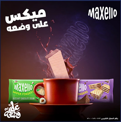
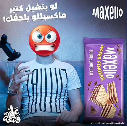
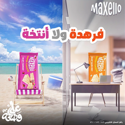
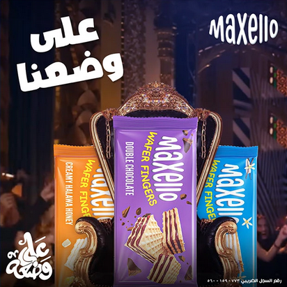
Every wafer flavor tells a story; from rich chocolate to smooth vanilla. We’ve created a unique color and visual system for each variety that helps consumers instantly connect the flavor with feelings and desires. - Social media Branding
We translated the Maxello Wafers identity into a strong, We translated the Maxello Wafers identity into a strong, eye-catching digital presence, to ensure that social media platforms remain as consistent and enticing as the crunch of the wafer itself. - Retail Shelf Visibility
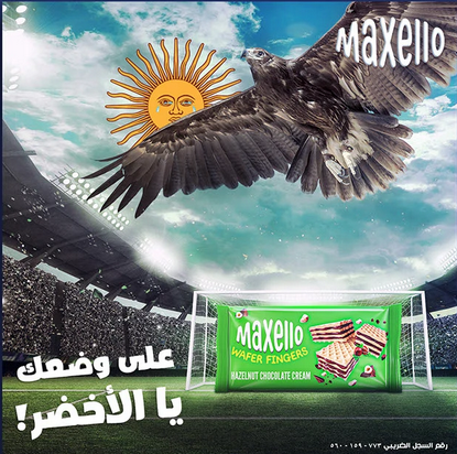
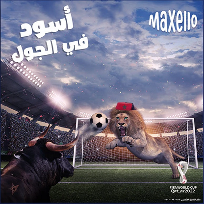
Standing out in the snack aisle isn’t easy. We designed a visual language for Maxello Wafers that cuts through the noise using strong color contrasts and a strategic placement of design elements that ensures the brand remains strong and appealing on the shelf.
Logo & Typography – Confidence You Can Taste
The Maxello Wafers logo was designed for clarity and easy recognition. The font balances smooth curves that evoke a pleasurable experience with strong geometry that reflects the brand’s confidence and strength. Whether printed on a small wafer wrapper or a large billboard, the logo maintains its visual purity and perfect consistency across all customer touchpoints.
Color Story – The Strength Behind Blue & White
Maxello Wafers’ color palette of bold blue and pure white is an effective psychological strategy:
- Blue: A symbol of trust and reliability, representing the emotional heart of identity and distinguishing Maxello from the traditional red colors in the wafer market.
- White: It acts as a “visual breath” reflecting purity, freshness, and clarity, which are key values that consumers look for in snacks.
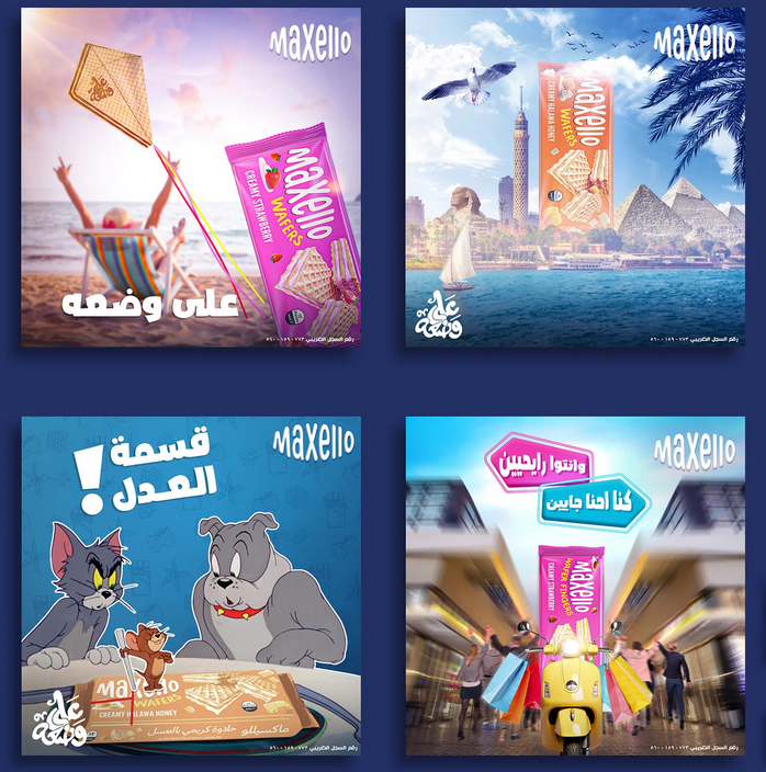
Left Paragraph: We don't just market wafers, we make them memorable. By combining data with digital creativity, we craft stories that make Maxello Wafers the consumer's first choice in busy retail aisles.
Shelf Impact & Digital Appeal A Unified Expression
Right paragraph: We don't wait for trends to pass, we create them. Through well-thought-out content schedules, we've created a dynamic presence for Maxello Wafers that evolves with its audience and always stays ahead of the competition.